Foodstuffs Northland
Delivery Practice Refresh (DPR) Dashboard
Foodstuffs internal maturity matrix platform: Design research and Data visualisation.
DURATION: 10 Weeks
ROLE: UI/UX Designer, UX Researcher
TEAM: Johnny Hopper (Product Owner), a team of two engineers and myself product designer
Brief
DPR Dashboard is an intuitive platform designed to foster collaboration and continuous improvement, facilitating informed decision-making, and ensuring every project reaches its full potential.
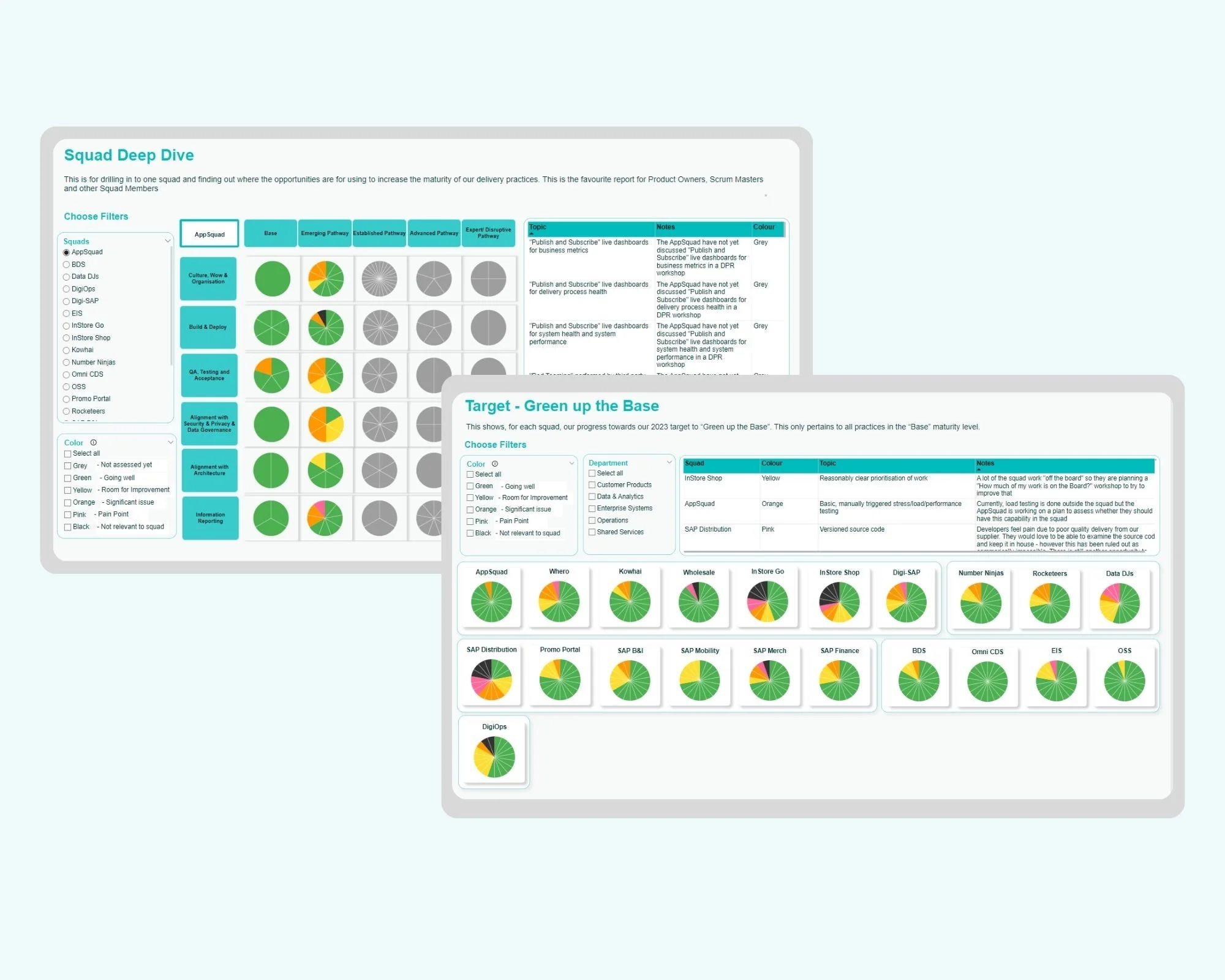
DPR Dashboard helps to visualise the current state of the Delivery maturity against all the practices and topics. There are various report views tailored for different roles within the Foodies department, such as CTO, scrum master, project lead, and product owner. These reports are designed to serve specific purposes and provide relevant insights.
My Contribution
As a UX designer on the DPR project, I focused on creating an internal dashboard specifically for the Foodies IT departments. Through user research interviews and applying design thinking principles, I tackled the challenge of transforming intricate data into user-friendly report formats on the PowerBI platform. This solution catered to the diverse needs of different department and squad manager hierarchies.
Project Unfolded with…..
You might be curious about DPR now 🤔, just like I was when we began this project. It was a new concept for me too! when I was given this challenge. I started by figuring out what it was, why it mattered, and how it was used.
So, what is Delivery Practice Refresh?
A Delivery Practice Refresh is about improving or refining the way of delivering the software or products by ensuring the process is smooth, reliable, and consistent. This involves taking a close look at the current delivery process, seeing what works well, and finding areas that need improvement.
The goal is to move from a foundational or "base maturity" level to a more advanced stage, known as the "futuristic pathway," where improvements are implemented to address identified gaps.
How this process was followed?
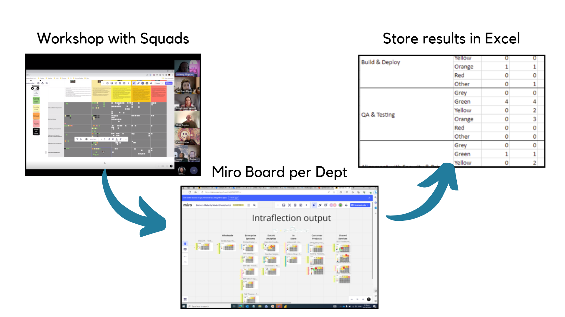
In the Foodies IT department, the Product Owner held a workshop on a Miro board for each "squad" as part of project management. During this workshop, a maturity level matrix called "Delivery Practice Refresh" (DPR) was used to assess how well each squad was doing. The results were then stored in a Miro board & an Excel spreadsheet.
Currently, DPR helps identify areas for improvement in software delivery at the “squad level”. It doesn't focus on broader program-level activities, but rather on individual team performance.
Each squad's details were noted on the Miro board as a form of internal feedback, with the squads color-coded to represent their performance. This color-coding system made it easier to organize and store the information in Excel based on each squad's perceived performance
Research
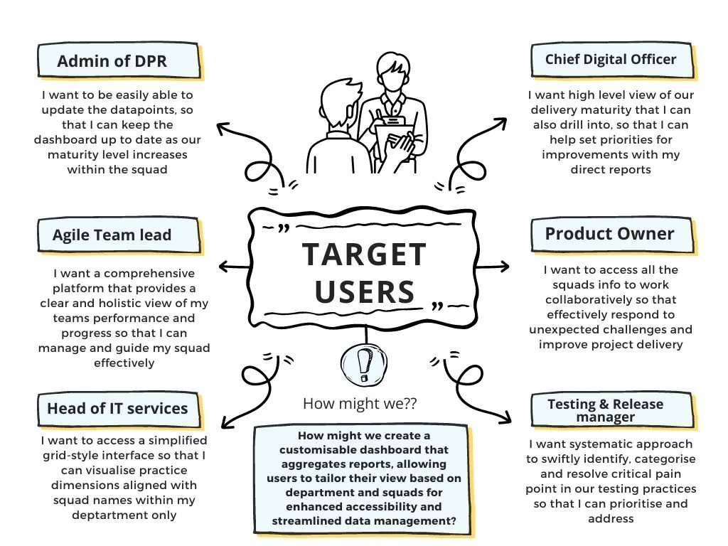
To understand what users expect from DPR and how the process is working for them, I did some qualitative research. This involved interviewing users from various roles and the goal was to get their take on the current process and what could be improved.
I took an iterative approach, conducting interviews with my stakeholders during each sprint to gather insights. My stakeholders included the CTO, product owner, scrum master, squad members, project leads, and heads of departments. I used their feedback to guide my understanding and to make improvements based on what they shared.
What did user say?
Ideation
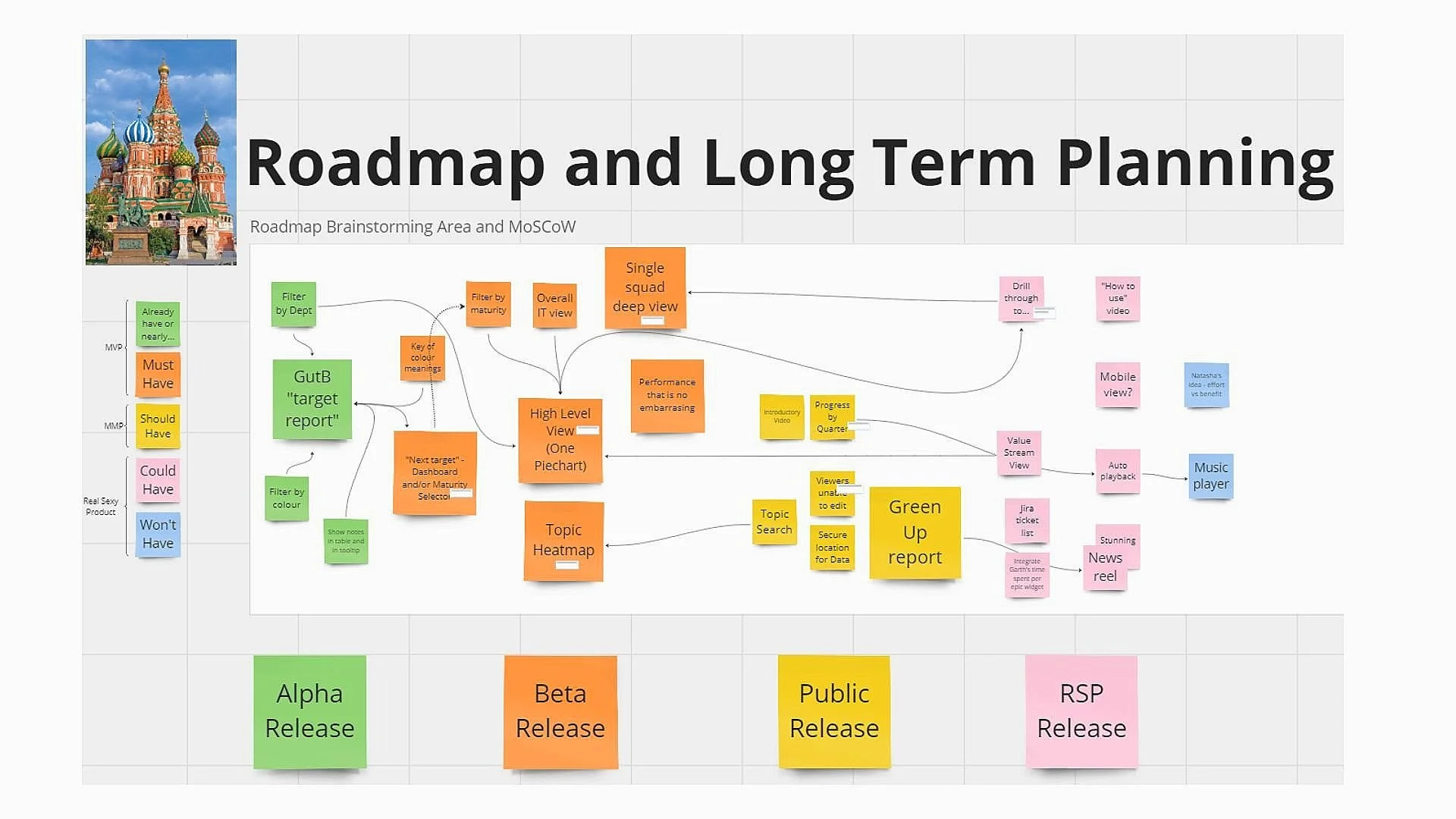
Following initial discussions with clients, we opted to develop a user-friendly data analytics dashboard on PowerBI. Utilising Figma for preliminary design sketches and employing design thinking principles, we aimed for a platform that is both easily navigable and straightforward to build and update. Beginning with organising key insights from user interviews, we adhered to the MoSCoW principle to attain our project objectives.
I embraced the opportunity to learn and apply PowerBI, contributing to the development of its basic UI. Recognising PowerBI's UI limitations, I creatively adapted its features to meet our project needs effectively.
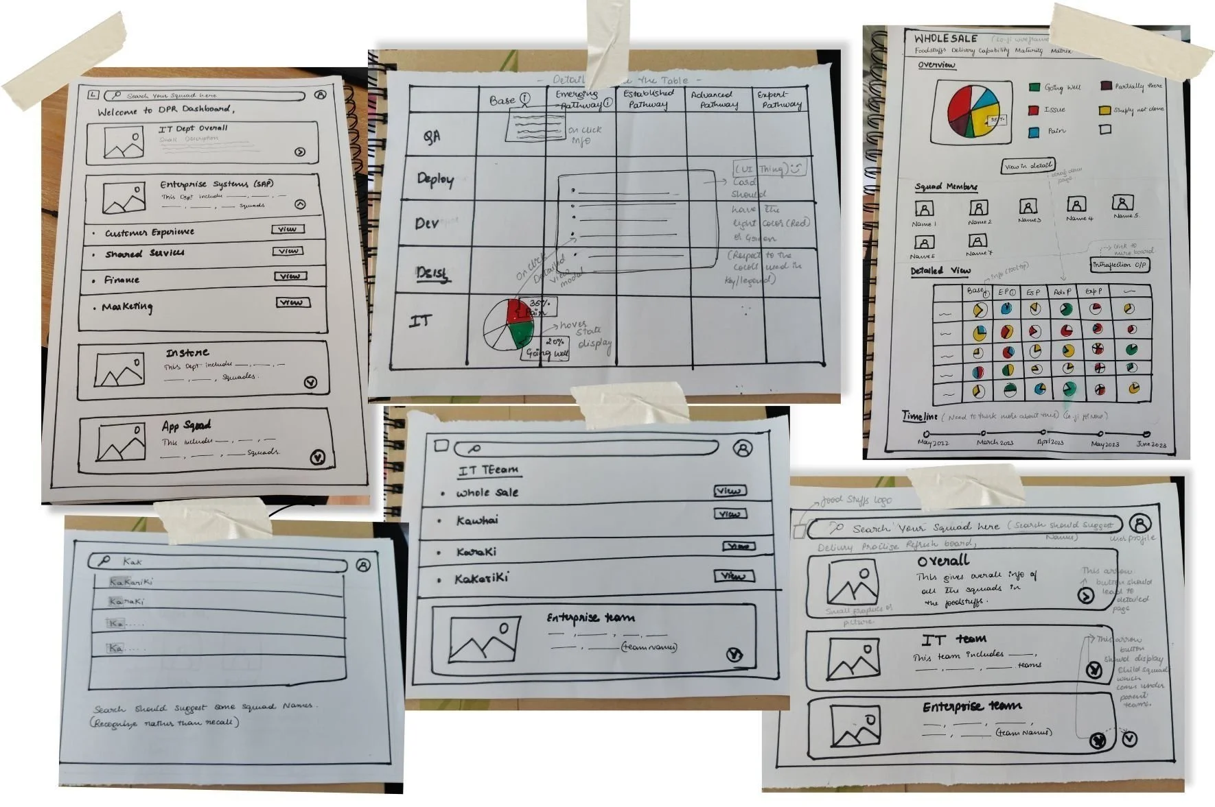
Initial lo-fi design ideations for the reports and the DPR dashboard landing page
Visual Design
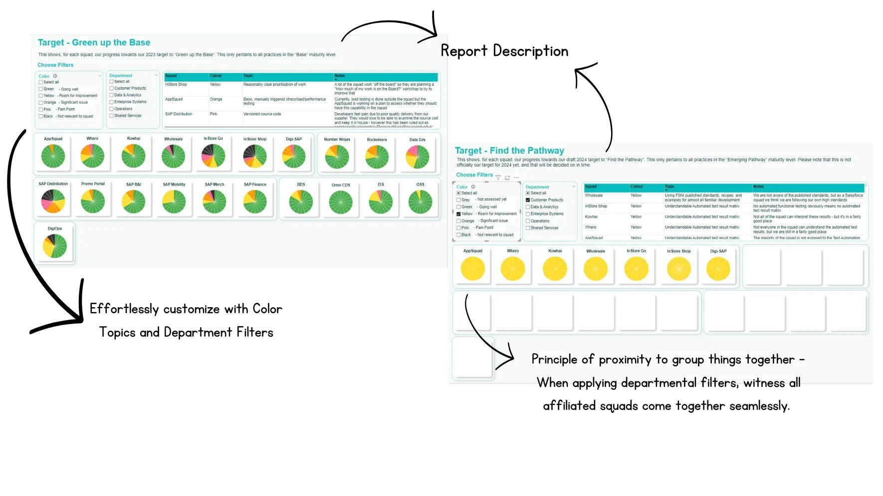
The UI of the site uses Foodstuffs signature aqua teal as the primary theme color. We also develop different theme colors for pie charts. Below is the final visual design of a few main pages, the original data was modified for confidentiality reasons.
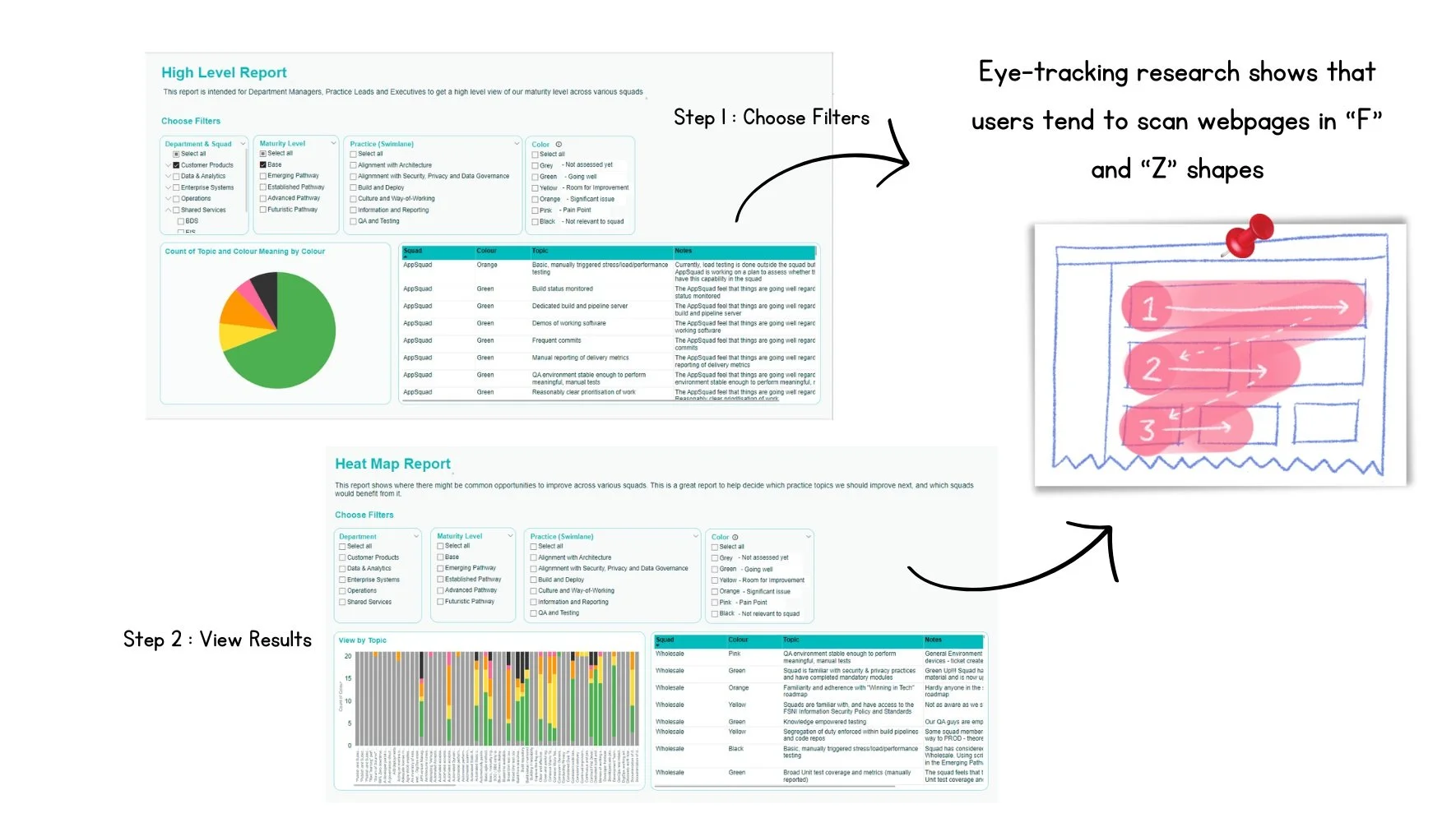
To enhance user experience, take into account the common eye-scanning patterns observed on web pages. For individuals who read from left to right (LTR) languages, these patterns typically follow the F and Z shapes.
The F pattern indicates that users are inclined to start by focusing on the top-left corner before scanning horizontally. Subsequently, they zigzag down the page, following a Z pattern, once again moving from left to right to navigate through subsequent sections or rows.

Takeaways
Collaboration, working with constraints, user research and user testing
Through this project, I gained valuable insights into effective communication with team and navigating design decisions. It provided a significant learning opportunity in user research, allowing me to actively apply new knowledge. I also developed proficiency in PowerBI and effectively structured our dashboard within its limitations. Collaborating with developers enriched my understanding of working with technical constraints and facilitating smooth handoff of design documentation.