Website Re-Design for a NZ Metro property management
Designing a new rental experience
The Challenge
Our main challenge was to make the rental property listings page easier to use, guided by valuable customer feedback. We needed to find a way to include both rental property listings and tenancy agreements without confusing users. Our goal was to make it simple for users to schedule property viewings and apply for tenancy online. This was especially important for people during times when there were restrictions (Covid-lockdown), so they needed a convenient way to secure a rental property before arriving in the area.
Why is it a problem?
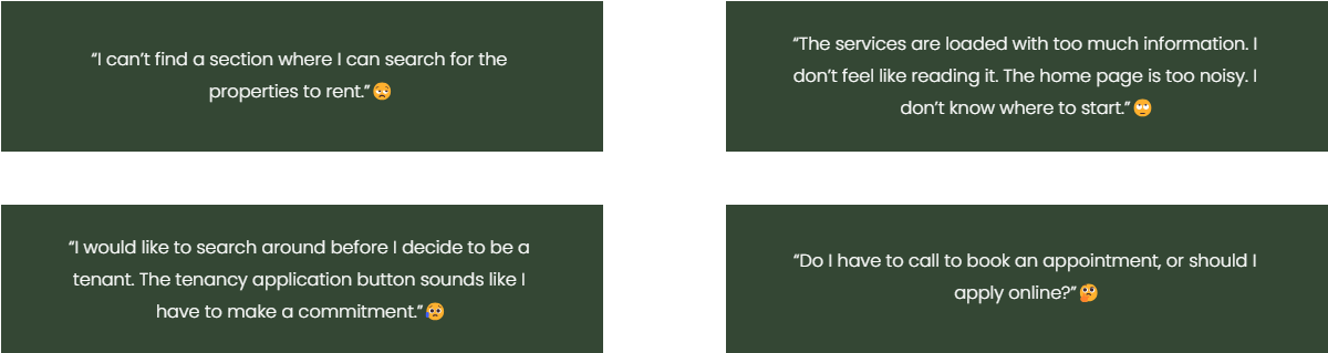
Based on customer feedback, the website and renting process have some problems. People can't easily find rental listings because there's no clear search section. Also, the "tenancy application" button makes them feel like they have to commit right away, which some don't like. They're not sure how to book appointments—whether to call or do it online. The homepage is busy and confusing, and the services section has too much information that people don't want to read. To make things better, we need to fix these issues and make the website easier to use.
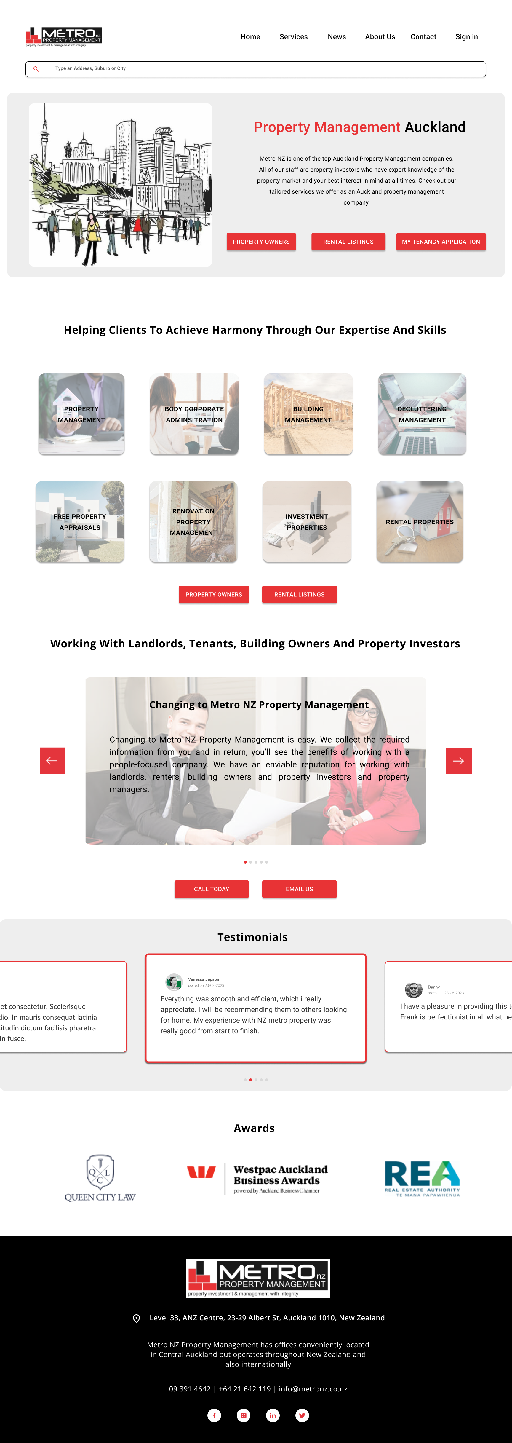
What was the appearance of the website before ?
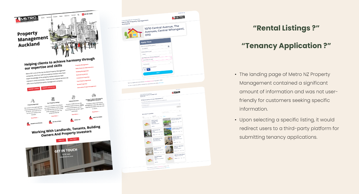
As a result…
How can we solve this problem?
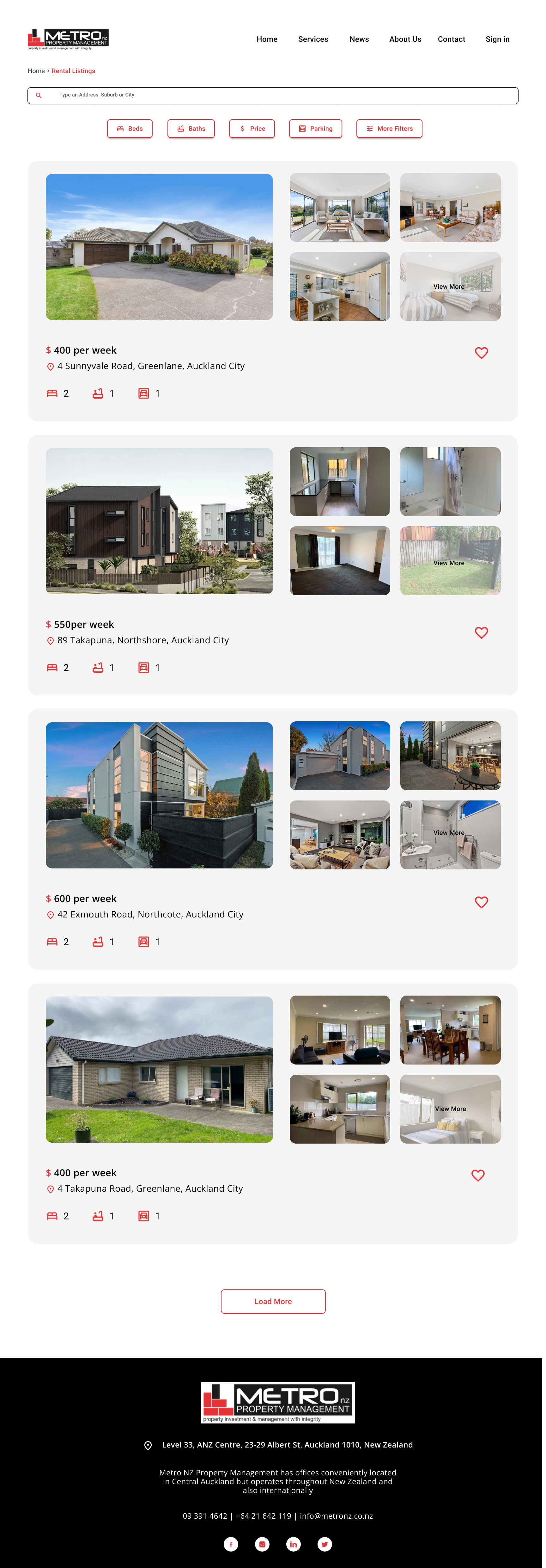
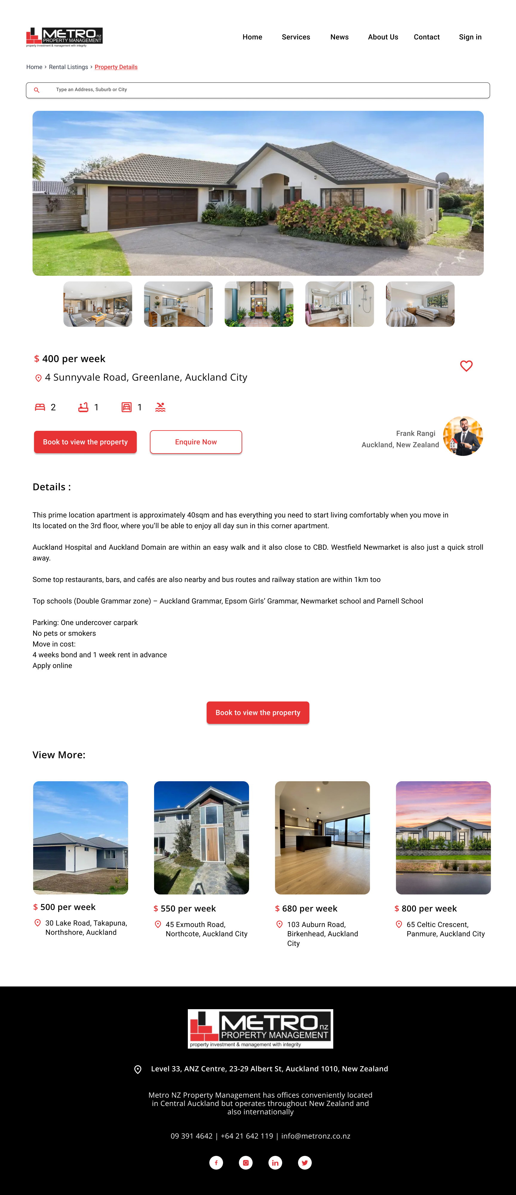
Solution
We came up with a redesigned Metro NZ property management system website focusing on:
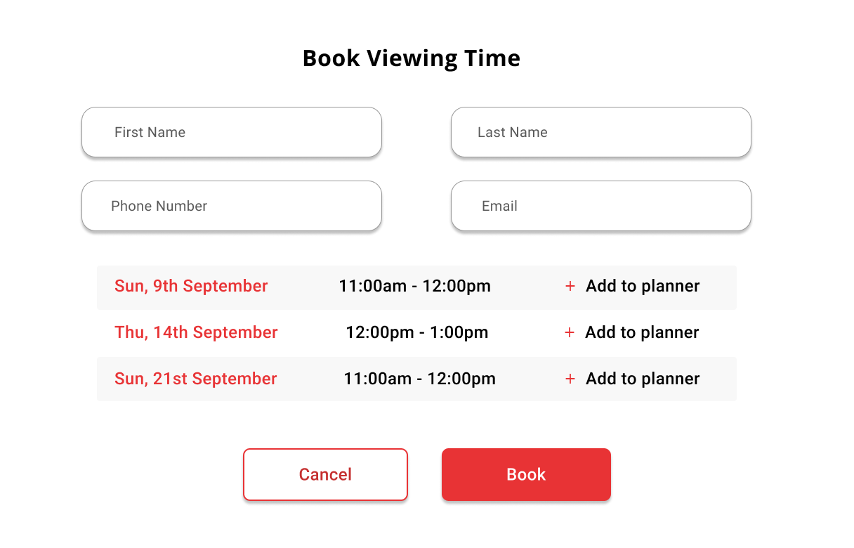
Streamlined Appointment Booking: The website now offers both online appointment booking and an enquire option for users who prefer to call, ensuring clarity and convenience in scheduling for viewing the property.
Simplified Homepage: The homepage was redesigned with a cleaner layout, reducing clutter and providing clear starting points for users embarking on their property search journey.
Transparent Tenancy Information: The "tenancy application" button was revised to provide clear information, ensuring users understand that clicking it does not commit them to a tenancy agreement but instead initiates the application process.
Improved Property Search Using Filters: A prominently placed and user-friendly property search feature was added, making it effortless for users to find and browse rental properties by applying filters.
Client
NZ Metro Property Management
Role
UI/UX Designer
Project Management
User Research
Prototype and Validation
Team
Jonathan Sihite(UX)
Jimson Montederamos(Dev)
Patrick Tricenio(Dev)
Duration
3 Weeks (September 2023)
Our Approach
We utilized the 5-stage Design Thinking Model to begin with foundational research before delving into design solutions. We also emphasized the importance of iterative prototyping and validation in the later phases of the design process
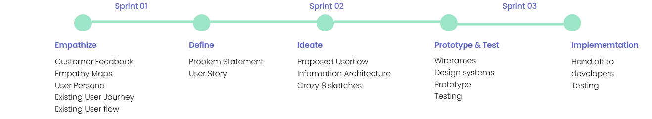
Research
Research Objective: We thoroughly immerse ourselves in the experiences and pain points of previous Metro NZ Property customers. Our primary focus is on gaining a deep understanding of the challenges within the current rental purchasing process and developing empathy for the needs and frustrations of existing users.
Gathering our research and empathizing with the user problem, we documented with an Empathy map, User Persona, and Existing user flow.
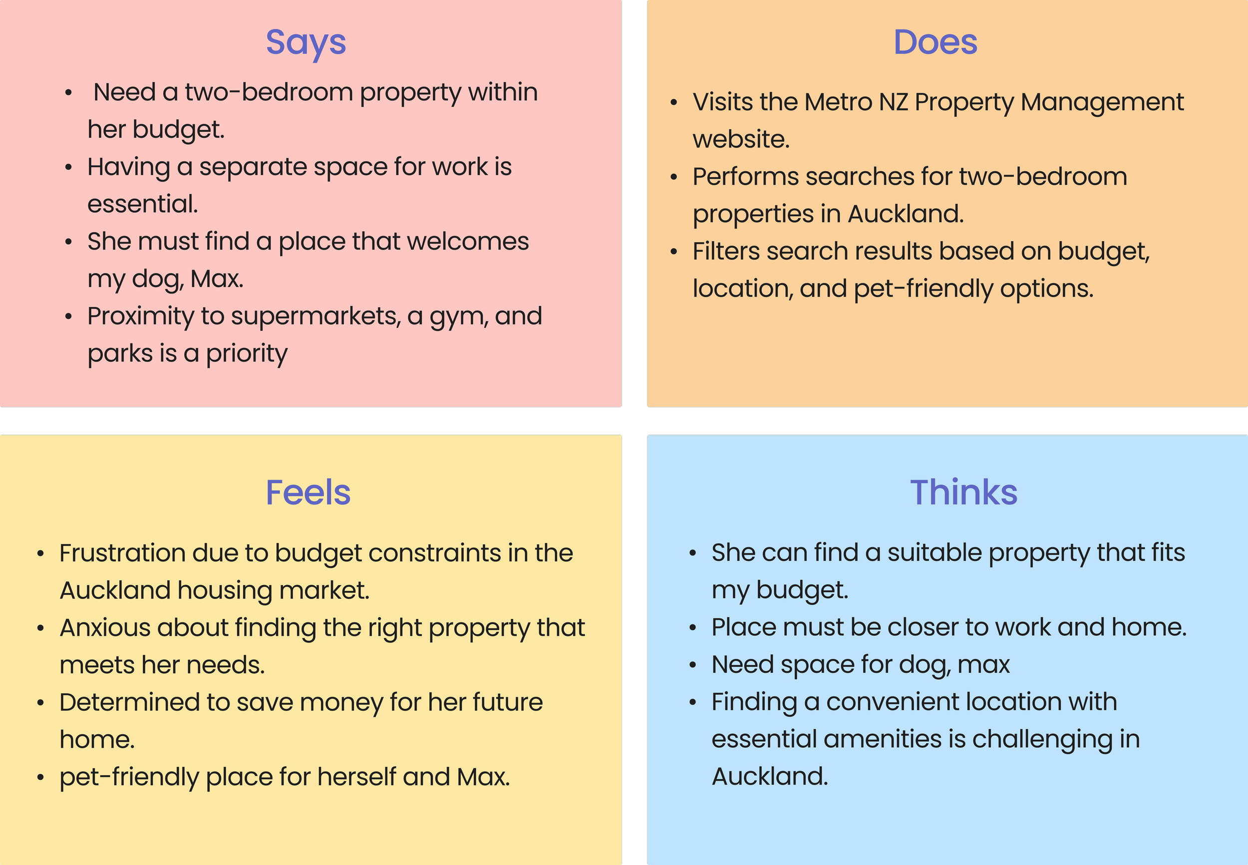
Empathy Map
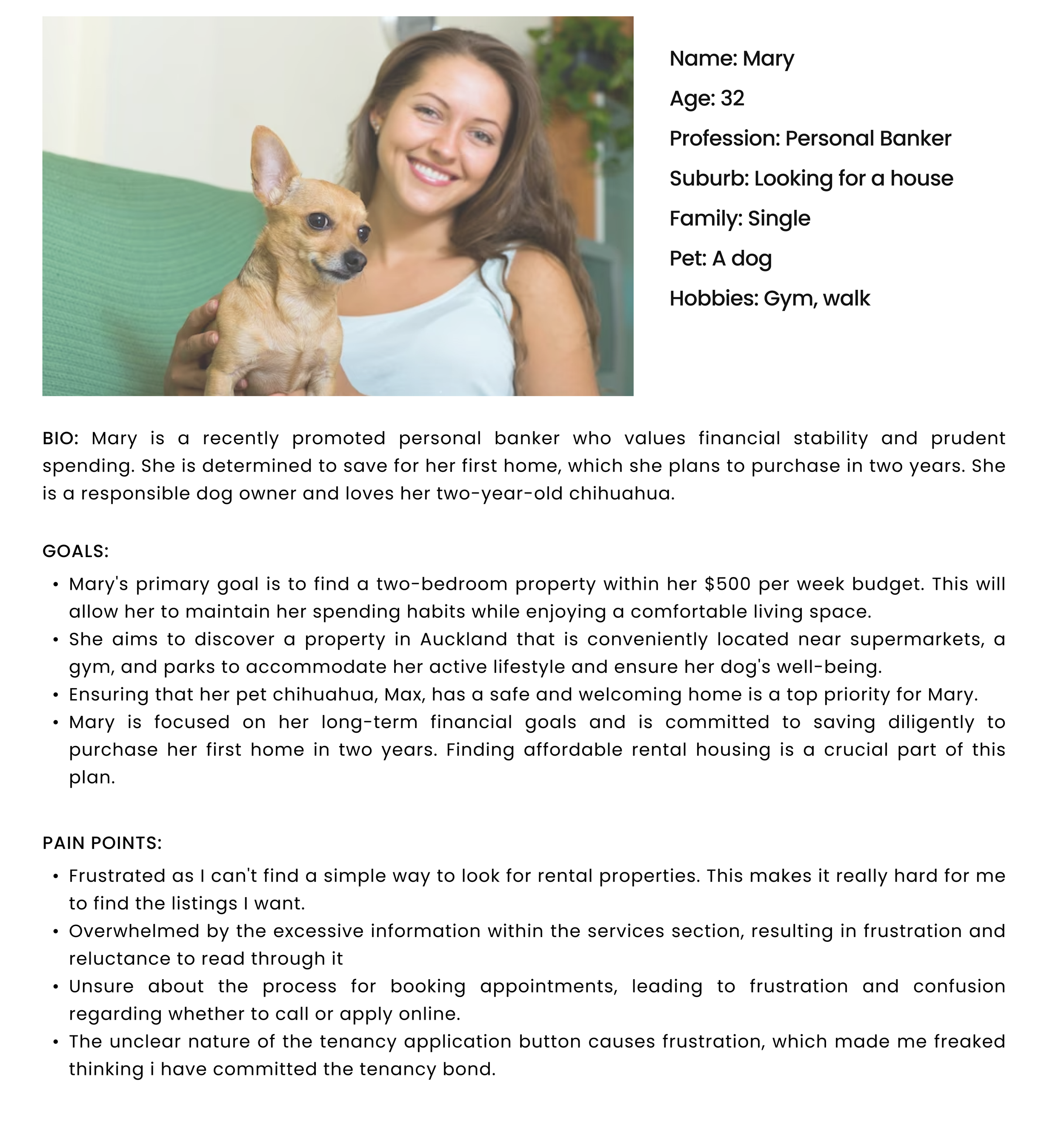
User Persona
Key Insights:
From the customer feedback, empathy map, and user persona we understood that the current process is frustrating due to the difficulties they face in searching for rental properties, navigating the website, and understanding the tenancy application process.
Users are taking more time, in order to book to view the property or view the property online. Users are confused whether to call or send an email if they wish to view the property.
Existing User Flow
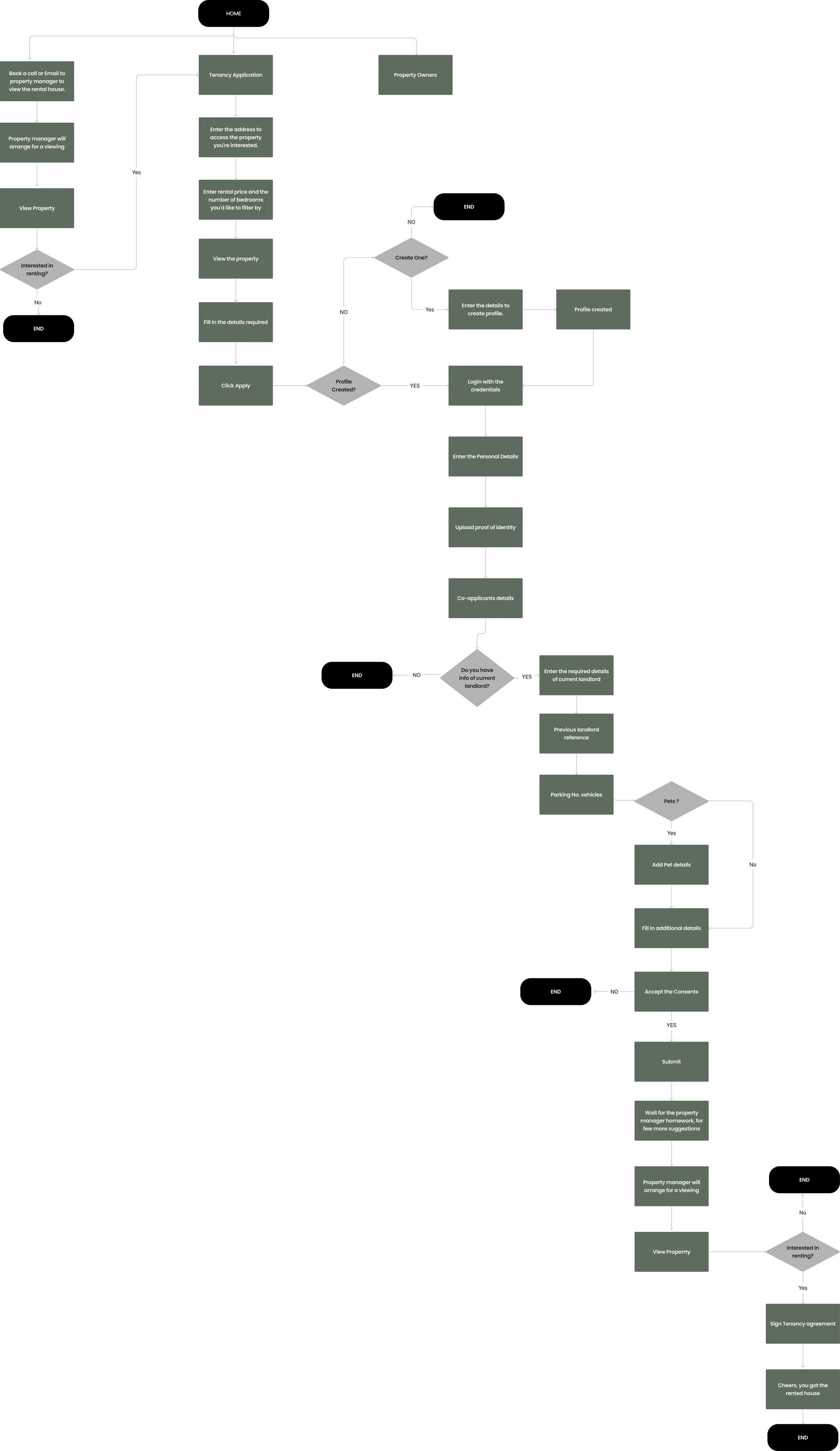
The existing user flow allowed us to identify the key stages in the process, that the user followed in renting the property. We also understand where the drop-offs are likely and customers are facing the real frustrations.
Key findings are as follows:
It takes a while to search for properties on Metro NZ because users have to make an account before they can do anything related to renting.
Users get stuck when trying to find property listings on the rental page, and they're not sure what to do next.
When they try to book a property viewing, they face delays because of a third-party application for tenancy agreement details. This leads to back-and-forth conversations between the property manager and the customer.
Defining the problem
Gathering our research insights, we discussed the problems faced by the users as a team and came up with a combined user story and a problem statement.
User stories focus on specific features or functionality from the user's perspective, while problem statements address broader challenges or opportunities that need attention
User Story:
“As a prospective tenant, I need to easily find, explore, and inquire about rental properties, so that I can make a property search straightforward and efficient”.
Problem Statement:
"The process of locating rental information on the homepage is unnecessarily intricate, causing delays in finding rentals through the website. There's a chance to restructure their homepage and menu to simplify the rental search for customers. Additionally, by highlighting applying the tenancy agreement online could potentially attract more customers and enhance the overall user experience.”
Generating Ideas
The ideation phase encouraged our team for diverse thinking, free-flowing creativity, and the exploration of multiple potential solutions. In order to bring up the user-centric solution we started with proposing user flow to get the structure of the process, Information architecture for easy navigation and the crazy 8’s for deisgn ideas.
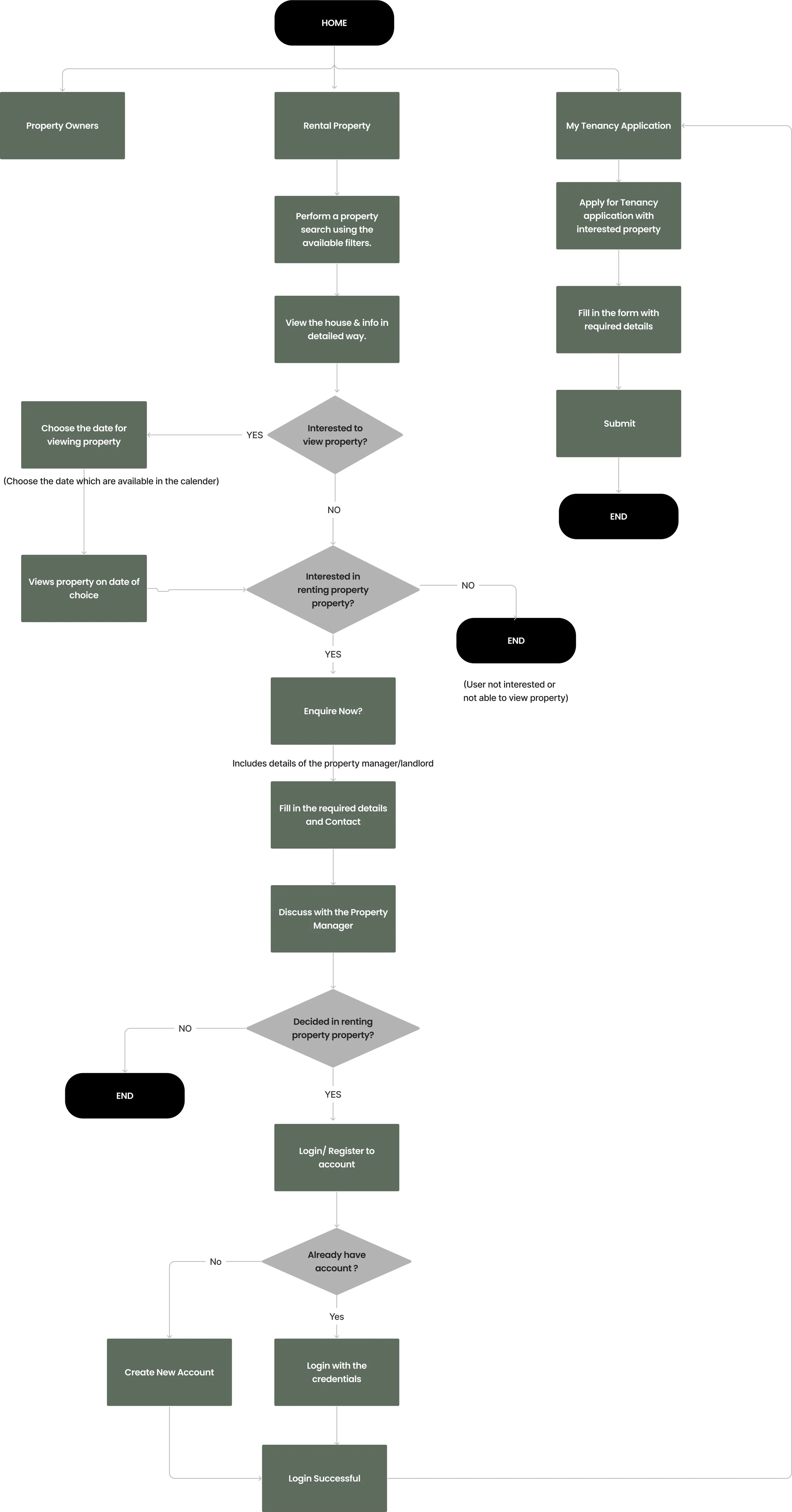
Proposed User Flow
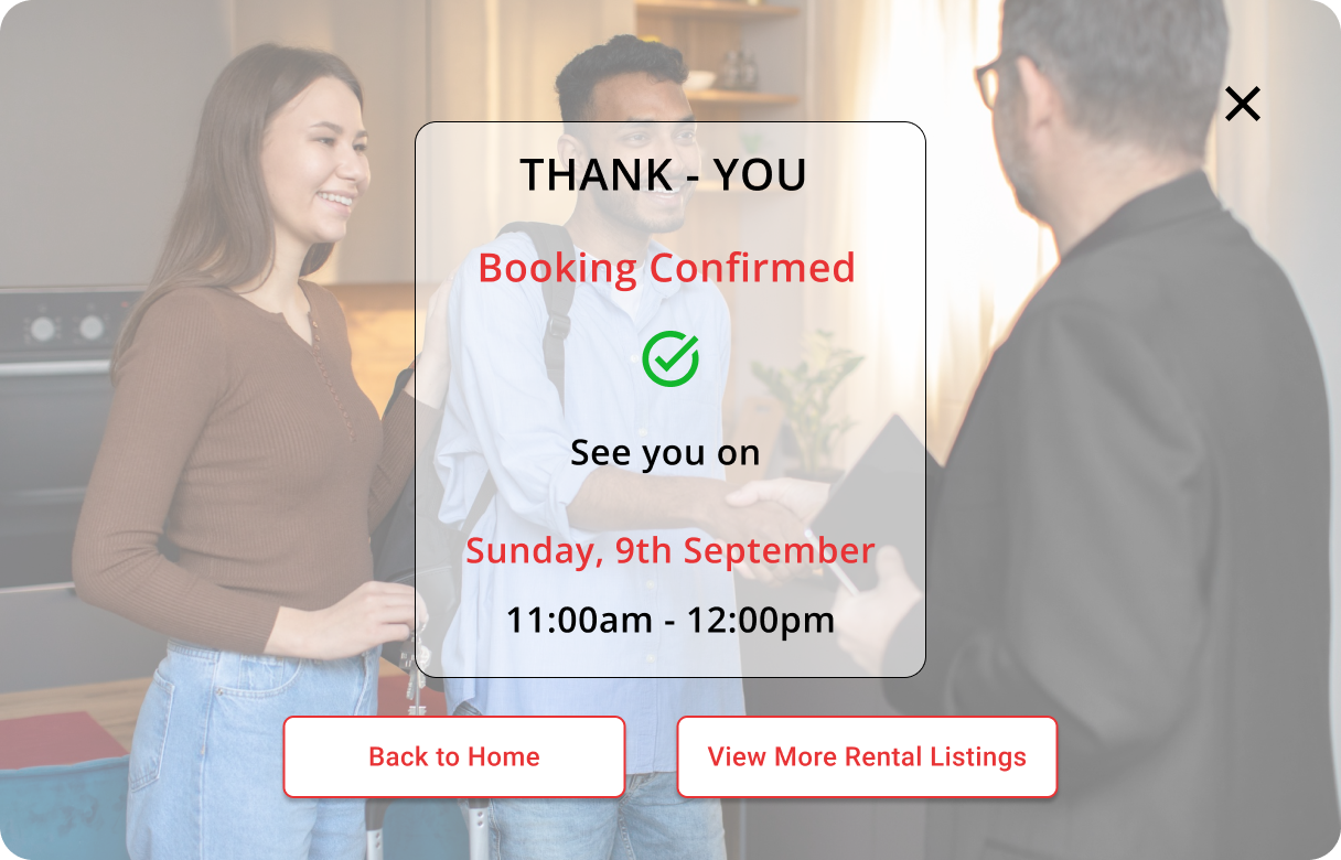
We came up with a new user flow as we progressed through the design process. As an MVP we focused mainly on rental properties and the tenancy agreement application, The proposed user flow follows two main processes:
Primary Flow - Help users by Booking to view the property/Enquire property/ Save Property.
Home > Rental listing > Rental property details > Book to view Property > Confirm dates > Booking confirmed
Secondary Flow - If users are satisfied with the property after viewing, they can proceed with creating an account with the Metro NZ property and access the tenancy application sent by the property manager with the respective property.
Home > My Tenancy Application > New tenancy agreement > Fill in the details > Submit > Confirmation.
Brainstorming Ideas
We began by quickly generating ideas using the "Crazy 8's" brainstorming method. This approach allowed us to create rough sketches of potential design elements, helping us decide what to include and what to exclude. We then prioritized by selecting a few ideas from the eight designs we drew, streamlining the process and avoiding unnecessary time spent on deliberation.
Prototyping & Testing
After understanding the problem and design solutions in the ideation phase, our team collaborated on Figma files and started turning our sketches into digital designs. After each version was finished, we tested the solution and made changes as needed. We repeated this process, leading to improved wireframe versions. This cycle of wireframing and testing greatly helped us refine our ultimate design proposal.
We practiced the lo-fi wireframes, ran test scripts, test research, and hi-fi wireframe methodologies in order to achieve this phase.
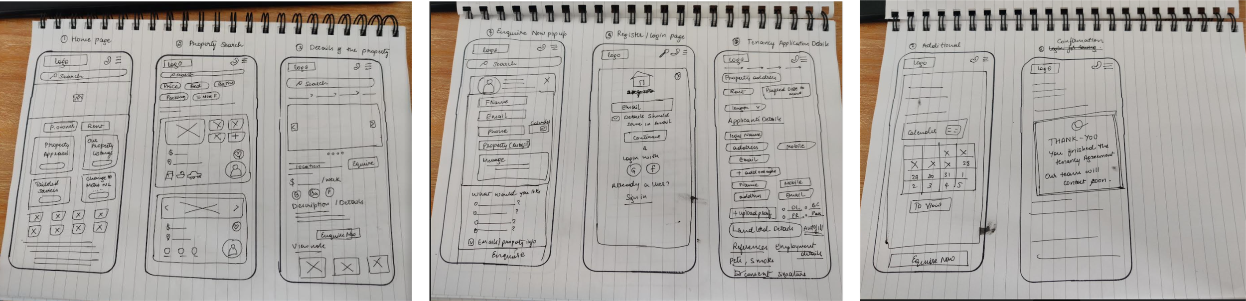
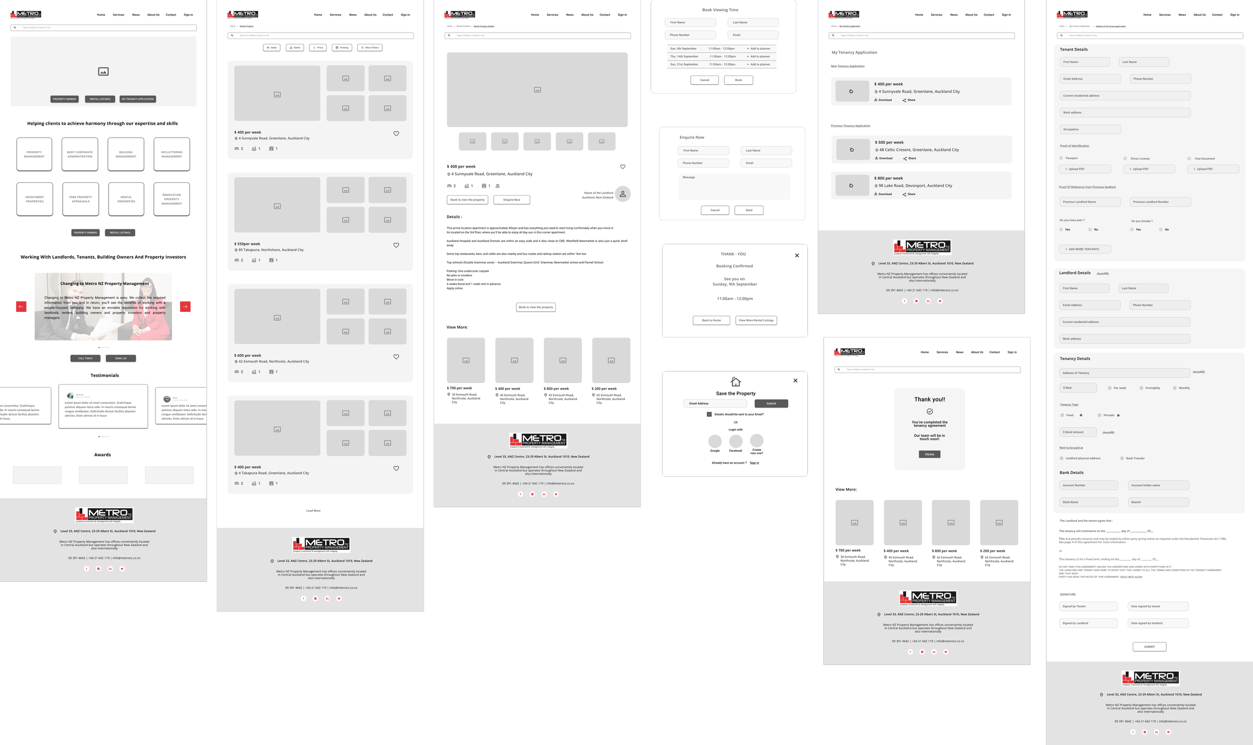
Lo-fi Wireframe Version 01
User Test Report:
Key positive takeaways from the new design:
The User found the new design layout of browsing listings quite helpful and straightforward to use. Found filters and icons easy to understand when
User thought the application form was very detailed but easy to complete
The user was initially confused when navigating the site but after taking some time thought the new layout was good and would use it again
New design met 1 objective (Determine if the user finds new design helpful or enjoyable when browsing new rental listings)-> SUS ratings of 1-5 for all questions
First test findings:
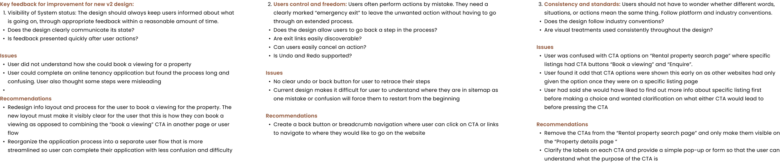
The design showed that the current flow needs improvement as the user could not complete one task (book a viewing with a property)
The design emphasized the need for CTA labels to be made clearer as the user believed “Enquire” to be an application for a tenancy and not a form to ask more questions
The design showed that some CTA’s were shown too early and did not conform with industry standards. Some CTAs were also placed in difficult places for users to locate such as the “Booking” CTA which was only visible once the user scrolled below a section to log in.
User was frustrated that there was no clear back button or method where they could undo and go back one step when making a mistake or wanted to retrace their steps
Lo-fi Wireframe Version 02
After the first test findings, we came up with the lo-fi wireframe version 2 addressing the feedback from the test users.
Second test findings:
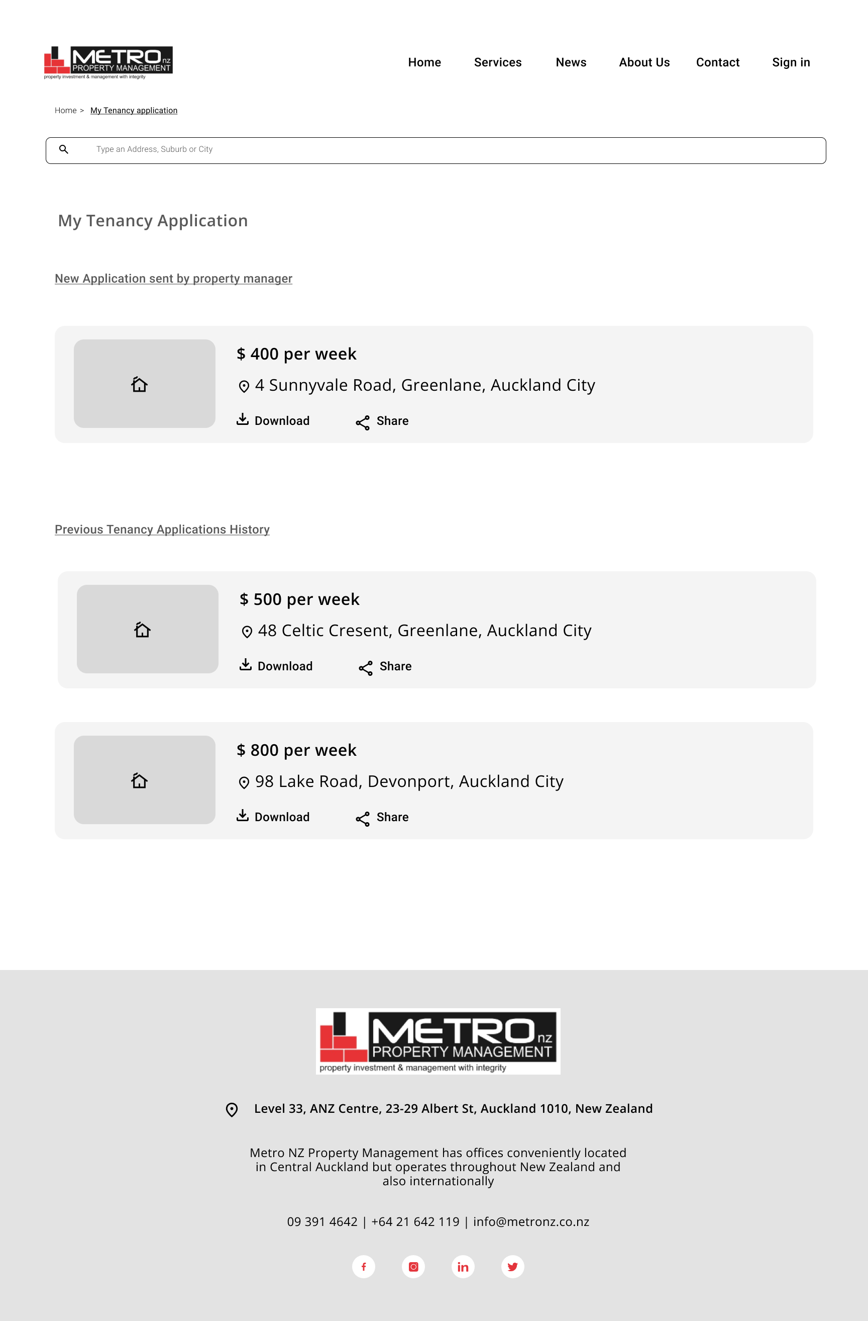
The user did not understand how to apply for tenancy online, the user thought the “my tenancy application” page was a history of previous applications and not a current application.
The user was confused with the application process and was frustrated that there were no instructions on how the process worked at Metro NZ Property
The user found CTA button texts to be quite small and wanted colors to be more vivid
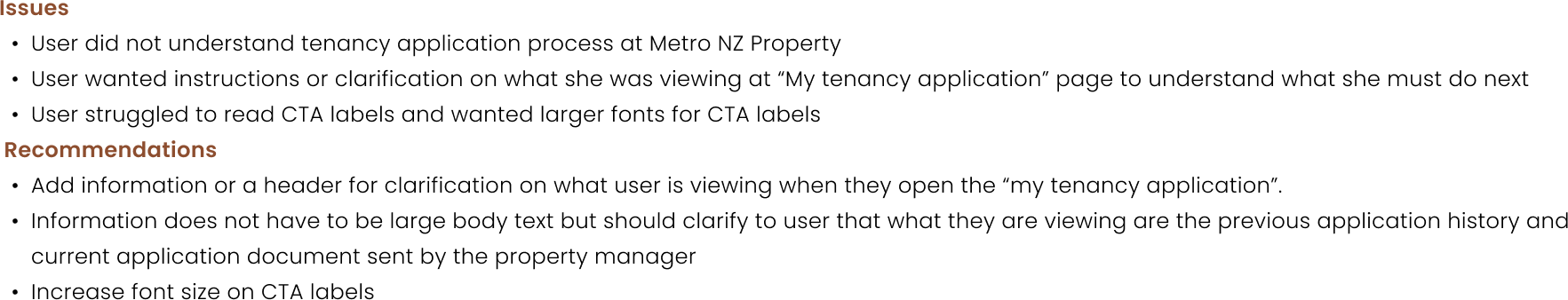
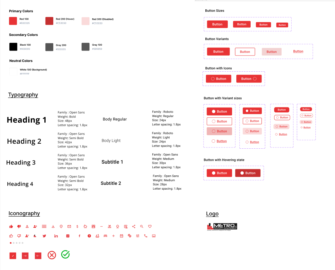
Incorporating the suggestions provided in our usability report for Version 02, we further refined the wireframe. Subsequently, we progressed to create a high-fidelity variation, which also involved establishing a design system.
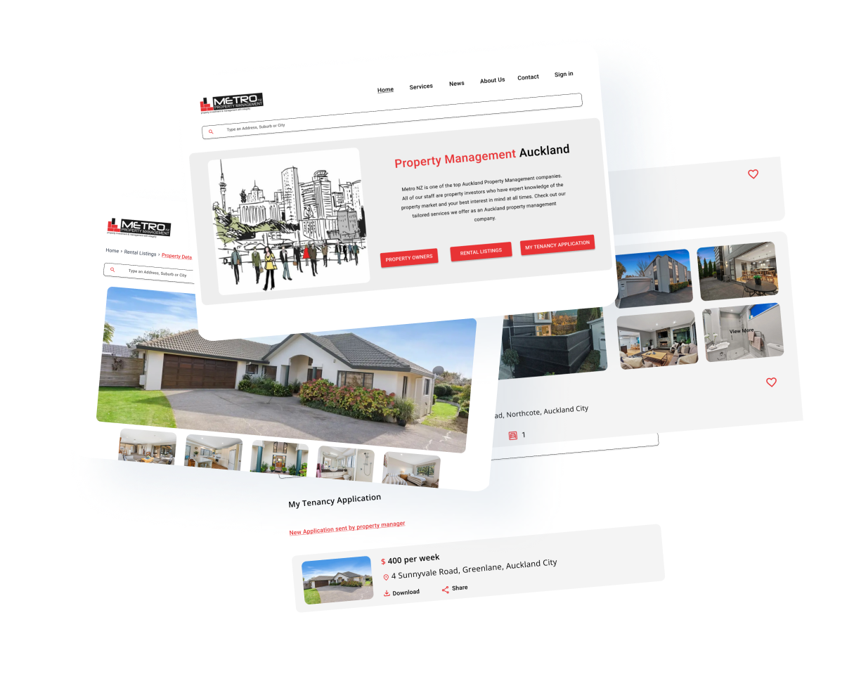
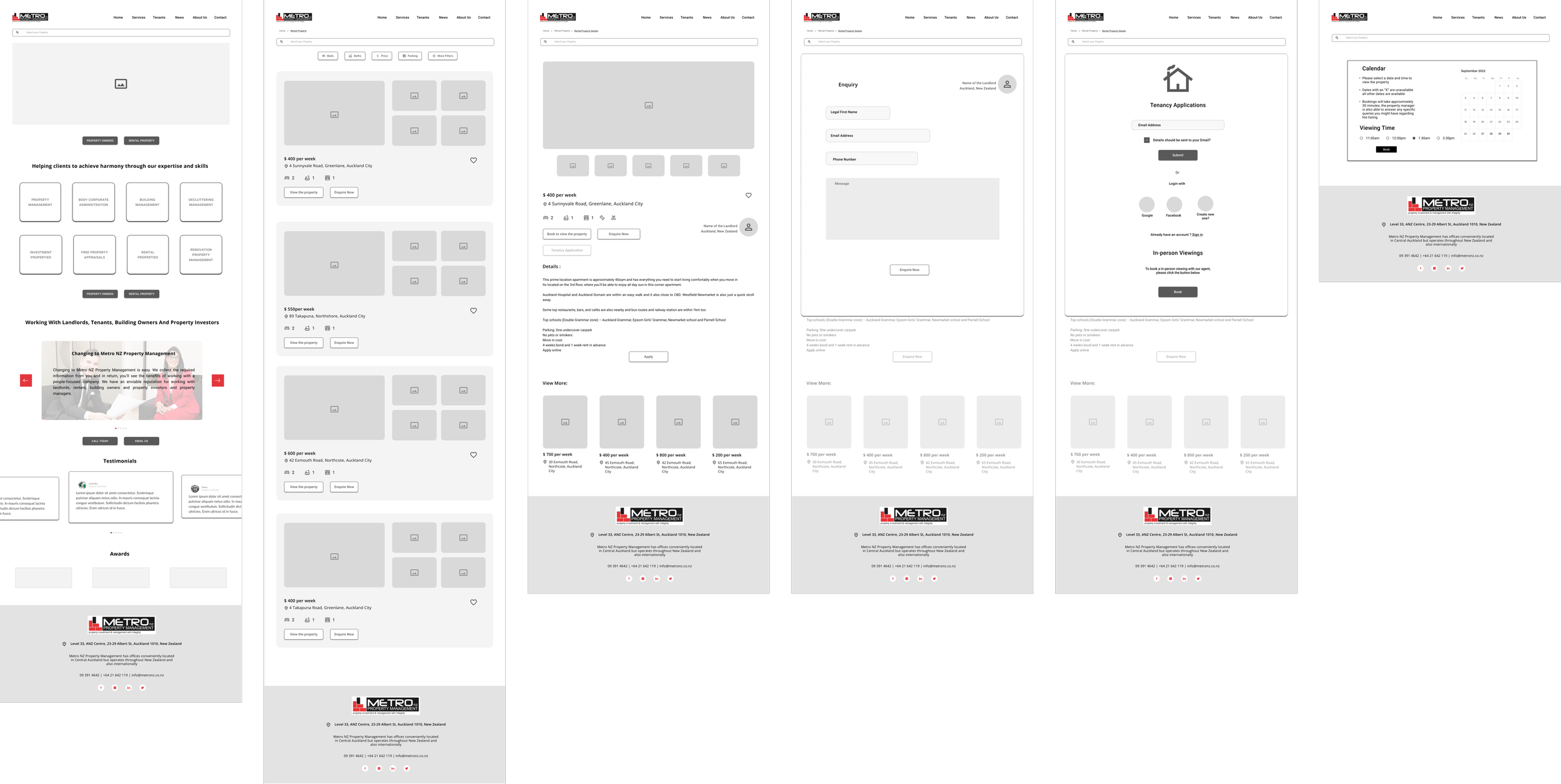
Proposed Solution
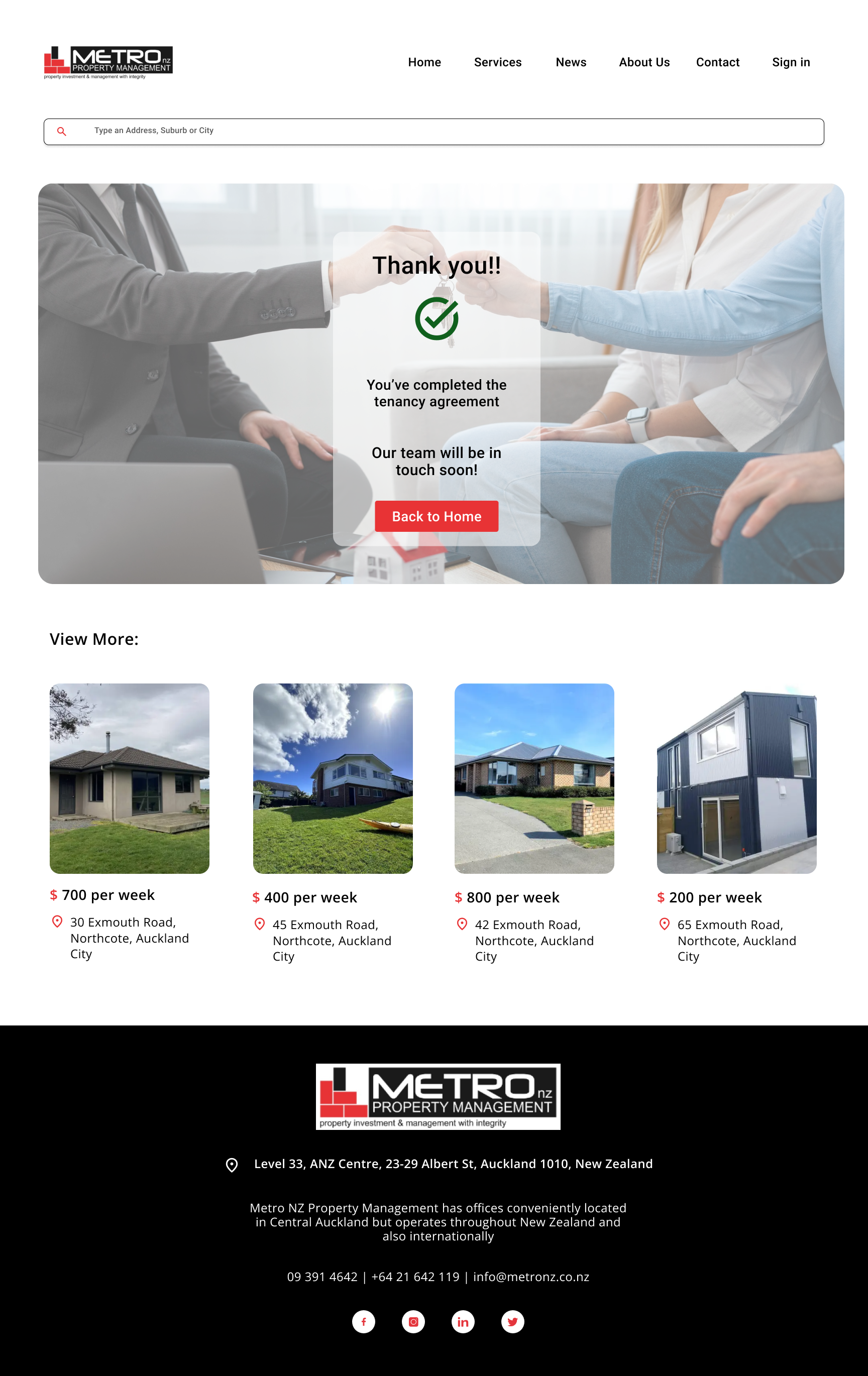
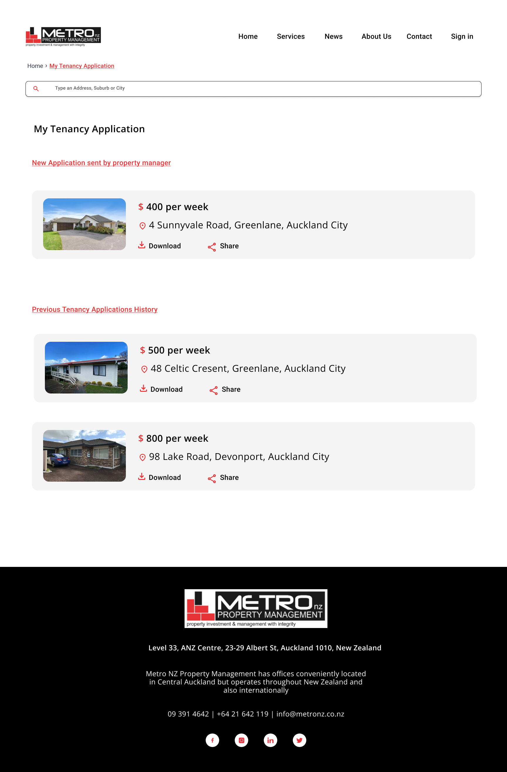
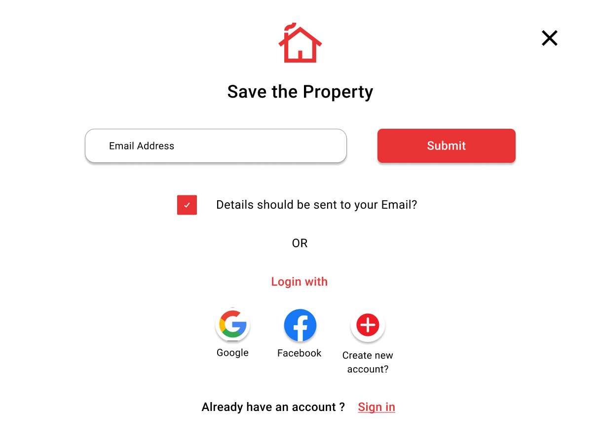
The redesign of the current Metro NZ Property Management website aims to provide a straightforward and user-friendly approach for users to easily book property viewings, make rental inquiries, and submit tenancy applications online.
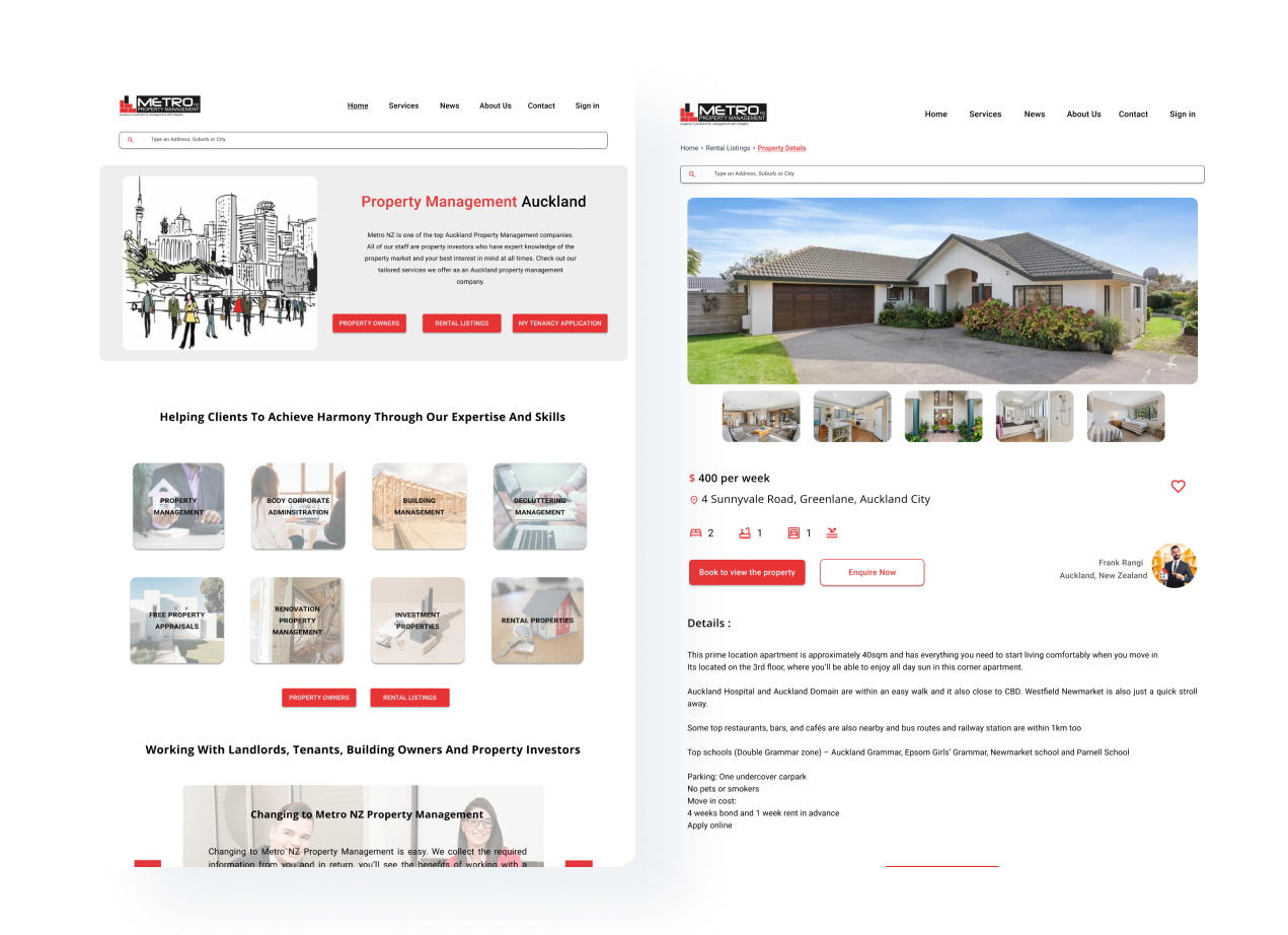
1. Home Page and book to view property page
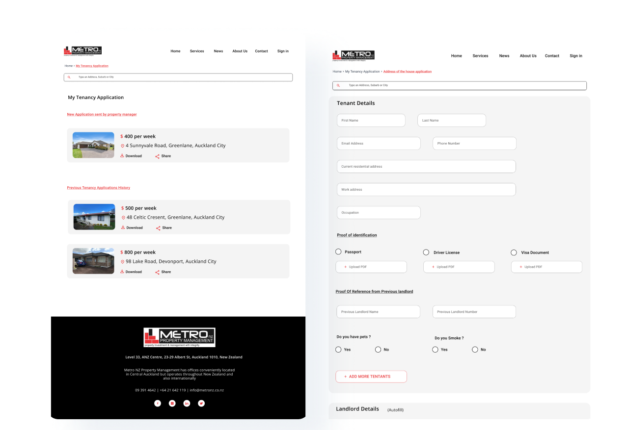
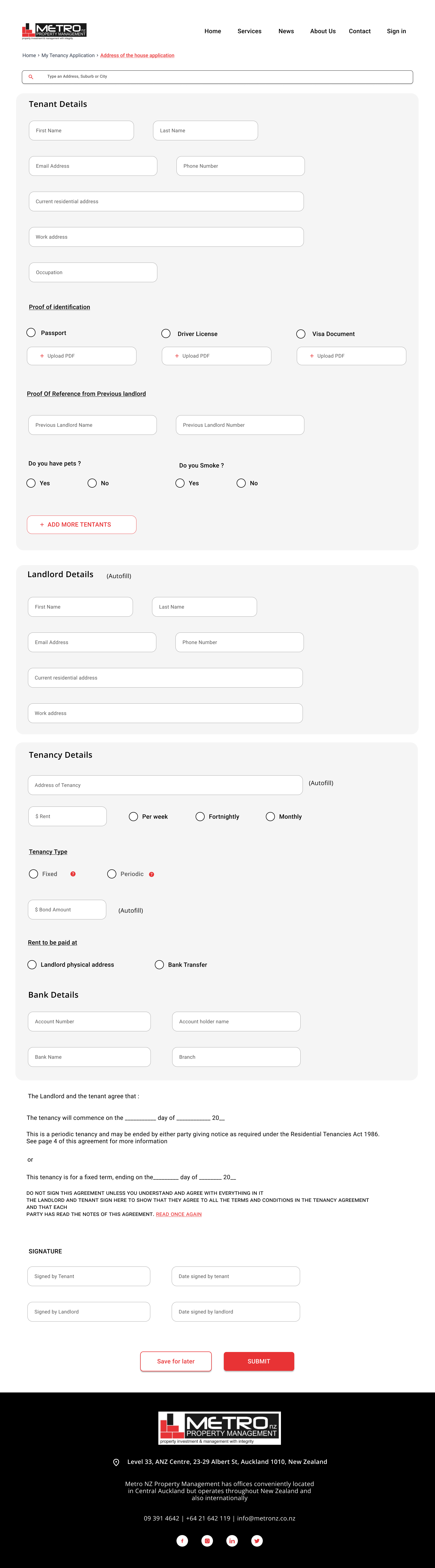
2. Tenancy Application
Reflection
Within a collaborative team environment encompassing both developers and UX designers, this project was a big chance for me to learn and grow. I got to improve my skills in understanding and defining problems, like a researcher. At the same time, I also got better at being a designer who understands what developers need.
Being part of the project right from the start taught me that good design comes from doing solid research and making sure it's right. This experience made me see how research and design go hand in hand, and it made me really curious about trying out different research and design methods. I’m eager to keep getting better and making our future projects even more awesome.